I did some research into studies on the colour pink for my digi-pak and found out that girls normally attract a like to the colour pink from a very early age of just two. Therefore by using this colour in particular on my digi-pak and also on my blog, I am attracting young girls and girls in general to view my artist and perhaps even take an interest into the CD as this colour just on its own has enticed them in. Vanessa LoBue, from Rutgers University, and Judy DeLoache, of the University of Virginia, conclude: “The current findings demonstrate that young girls do indeed have a special affinity for the colour pink that appears sometime in the second half of the second year. “This research lends important information to when children develop gender-stereotyped colour preferences and has important implications for how they develop as well.” From the age of birth boys and girls are straight away differentiated by the colour pink and blue, therefore girls commonly grow up surrounded by the colour pink i.e. the pink bedroom, pink clothes, toys and even the media present young girls programs in pink, franchises and brands such as 'Barbie' which have a huge impact on young girls from an early age and then they grow up around this and are consumed in it by media platforms and society, therefore girls instantly like the colour pink. I know from speaking on my own behalf that even at 17 my favourite colour is still pink and if it came to picking an object from a selection of colour I would always go for the object that was pink, that there is a clear element which draws girls in particular to pink objects. Therefore by the typography and also the CD disc in my digi-pak pink this will attract to girl and also mainly towards the girls based in my target audience. In this article below to summarise, researchers did an experiment to see the favourite colour and although the results found that even though the favourite colour overall was in fact blue, the women in the experiment always chose redder shades of blue than the males. Furthermore they also found that the colour Red is also more popular in Britain. Scientist believe this is because whilst males in prehistoric times used to be the hunters and go out and gather food the women used to stay behind a produce it i.e. commonly being around ingredients such as red berries, therefore they believed this stemmed a like to the colour red and also its sister colour, pink.
When it comes to creating my second digi-pak after looking through all the images from the shoots we did, I have selected certain images which I feel will compliment each other nicely on the final product, using a range of long and wide establishing shot, close-ups and extreme close-ups.
This image In particular I am considering for either the front cover of the digi-pak or even as the image to have as just a feature image on the album perhaps behind the lyric book which we are going to create, with this image also being the front cover of the lyric book. I was considering doing the whole album in black and white to add a more elegant feel, with hints of colour throughout i.e. when you open the CD case up the disc will also be in colour perhaps I am thinking at the moment a pink rose, to address the artist femininity and also I feel this colour in paticula will make her appeal to the younger range within her target audience i.e. those in their early teens as the album would appear to be quiet 'girly' as this stereo-typically would attract their attention.
Furthermore for the back cover of my digi-pak I have decided to use a long shot in order to portray the artists whole body, therefore making her album also appeal to the male gender as this image would sexualise her, again as i have previously mentioned relating to Mulvey's theory of the 'Male Gaze' and also voyerism. This image I have selected I feel does this well along with some of the other close-up images I have selected as her body language and also facial expressions, the ideology behind the idea of her head also being tilted up slightly can be related to mens magazines where the models in these often also form this pose in order to capture the male attention as it can be considered quiet sexualised and suggestive.
I also am considering using this image of Poppy as again it adds I feel to the male gaze aspect, I think this would be a good image to incorporate into my final digi-pak again perhaps converting it into a black and white still. It also links in with other CD covers I have looked at for others artist preforming in the same genre such as Pixie Lott and Ellie Goulding as many of Pixie Lott's CD covers carry out the same poses and facial expressions as this image here.
After looking at the pictures from the previous shoot we did with Poppy, we decided that we would need to redo another shoot, therefore this time we used a different location, we used one of the normal class rooms, due to the Gallery being out of use and then used a white screen placed behind Poppy, we then used extra lighting elements in order to make sure we could capture the perfect shot and also by placing the lighting in specific places, it enabled us to also loose Poppy's shadow. From this re-shoot we have also decided not to use the other set locations such as Greenwich, due to the weather conditions, we have gathered enough images for our digi-pak from this shoot and found that will be suitable and can be manipulated on photoshop to make them presentable on our digi-pak.
As we decided that we would need to do another shoot with Poppy as we felt that a change in the outfits to a more "poppy" colour such as pinks,white etc would benefit us when creating our digi-paks as they would be more relatable to the genre. We also felt that by doing another shoot this would also increase the amount of pictures taken therefore we would have more to pick from. Furthermore by initially doing another shoot this allowed us tho change the make-up appearance of our artist by using more vibrant lip colours such as pinks again to emphasise more the genre of the music our artist creates and preforms.
We all added ourselves to a group chat using the social networking site 'Facebook' in order to communicate with each other when the best time to do another re-shoot was, making sure Poppy was going to be available at the set times along with the other members of the group. We initially want the re-shoot to take place in the same location as the previous one, i.e. the gallery however if this is not possible at the time then we have the alternative plan of locations, such as using a normal classroom and placing a white screen behind Poppy in the pictures.
The photoshoot we did with Poppy on Friday in the gallery went well, we got a selection of images that we are looking at using in our digi-paks, however we have decided that as she is dressed in Black we are going to edit the colour of her clothing in Photoshop. However we have decided that we may need to do another shoot, in order to get some more images of her, to put on our divi-pak, along with the other shoot we have planned which will take place in Greenwich in front of the coloured houses.
This is a preview of the conversation between our grow and our new artist Poppy, discussing the costume and also the days in which she can attend the shoots and further more where we are going to be filming the gallery, as there is a plain white background in which, will make our artist stand out more.
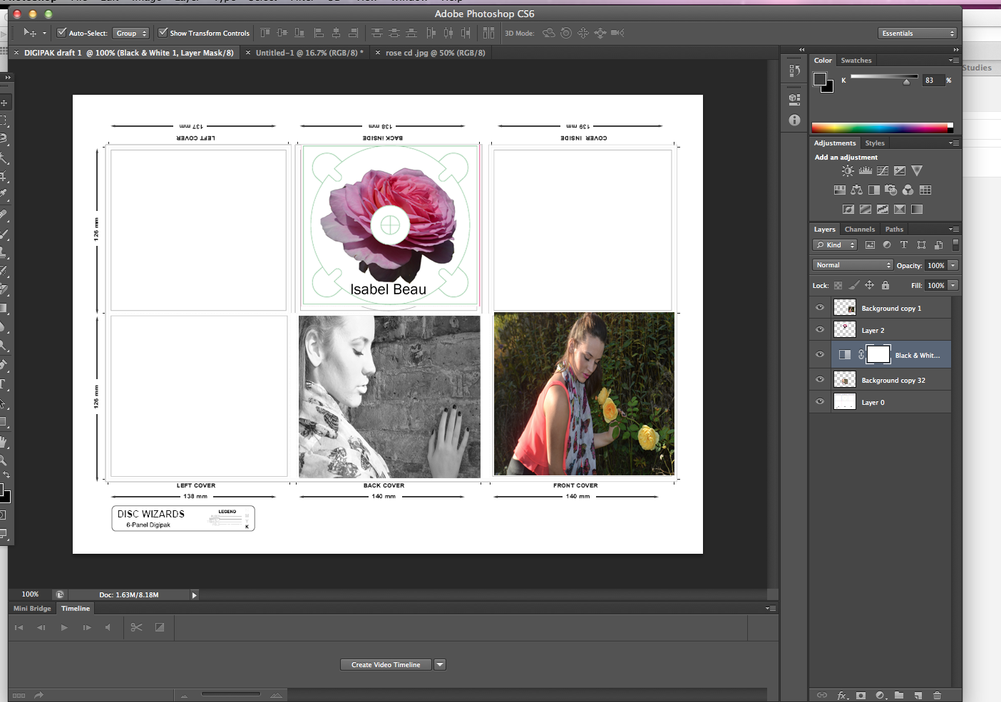
Today I started on the first draft of my digi-pak using the images we have got from the first shoot of Megan In order to give the idea of how my final digi-pak is going to be portrayed, again the same as the music video we are creating I am thinking of using a selection of black and white images along with some vibrant colours in selected area on order to make the digi-pak stand out. Although we have changed the actor who is going to play our artist Isabel Beau, it give the idea of the theme and imagery we are trying to create and portray our artist in. I am using photoshop in order to edit my digi-pak using a variety of different tools and effects to add depth and meaning to the images. The typography I am planning on using is very plain, this purposely so the audience will focus more the images than the album title, however the name of the artist I have selected to be on a more artistic font therefore so it is more recognisable to the audience, who will then start to recognise her as a brand and her name will become more familiar.
After our pitch presentation we as a group had a discussion with Sean about where our second shoot was going to take place, originally we thought of using Notting Hill, Portabello road as there is a selection of pastel coloured houses which we thought would give our digi-pak cover a fun and youthful feel and also represent the pop genre well. However after doing some research into how long it would take us to travel to Portabello road along with fares and equipment and also incase we needed to do a re-shoot we decided that it was not practical.
Therefore we come up with the concept of instead shooting it at Dacre road in Blackheath which again has the similar concept of the pastel coloured houses and this would only take us 20 minutes to travel to. Incase this location does not work we also have a secondary option of shooting outside of some houses by Greenwich orthodontist, again only a 20 minute travel. Therefore these new locations will deliver us with the same idea qwe wanted to go along and are also more practical to commute to.
After presenting our pitch to the class we received some feedback that we should have included the moodboard and images of the actors who are going to be present in our music video, adding to this the audience wanted to see what our artist was going to look like, as they only had a rough idea from the influences we added on the front cover therefore we have added in some images that we have taken off of Poppy's instagram as she is going to be portraying our artist Isabel Beau.
After doing our group pitch we found that from the feedback we received that the narrative was going to be a bit complicated to understand therefore we have decided to change the narrative to only using Megan's sister grace and poppy to differentiate between the artist past and background story being portrayed in the music video instead of our original plan to show the progressive years of the artist growing up. we will convert the narrative of the video into black and white, when Megan's sister is present to show that this is the artist childhood, I feel giving a nostalgic feel to the music video. However when the artist herself is present, I.e. Poppy who is representing her we will film this part in colour to portray the aspect of the present. The use of the colours are there to make the music video more clear to the audience in helping them to understand the concept of it.
From the photo shoot that we did the other week after closely going through he images we had taken, we have decided that Megan who was going to be our artist didn't match as closely as we would have liked to the stereo-type of a pop star therefore we have decided to change our artist to Poppy, who fits the stereo-type better and also is a better representation of how we want our artist to come across t the target audience.
bellow are some images of what our new artist looks like.
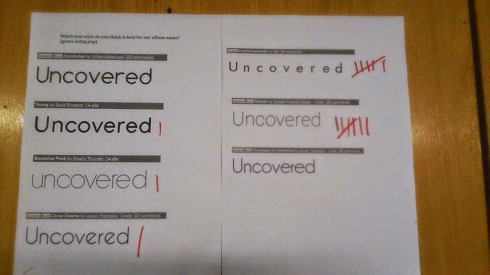
When it comes to portraying the title f the album on the front of the digi-pak we decided to use a quite simple and basic font, as from our research into the pop music digi-pak we found this technique quiet familiar. We also all agreed that by doing this it would allow our artists name to stand out more, therefore making her more recognisable as a brand to her target audience. The use of the fonts that we found off of 'Dafont' we found them to look quiet classy and sophisticated therefore again adding to the ideology behind how we want our artist to be presented.
From the fonts that we found we created a chart and then passed in round in order for people to vote on which one they found was the best, the results showed a conclusive answer that one of the fonts we had selected was popular than the rest, we have now decided to use this particular font on our digi-pak cover.
When researching into the font we wanted to use a suggestion was put forward that we make the 'U' and the 'C' into capitals, when doing this we found that it didn't fit the profile we wanted our digi-pak to look like also may have added some confusion to the audience as to the region of the artist, therefore we have decided not to use this in particular.
After a conversation with Sean we have decided that it will be better if we have a script prepared when presenting our pitch to the class, as it will come across more organised and more efficiently put together. We have shared the slides out between all four of us, each of us discussing the slides which we are most familiar with, therefore we are able to provide the audience with the most information possible.
This is our final pitch for our presentation of our music video and also our artist. The powerpoint includes Goodwin's analysis, the kind of record label our artist will be signed to, the ideology behind our artist, target audience, narrative behind the music video, details of the performance, location, type of clothing we want our artist to be presented in, the concept behind the music video and how our artist fils into the music industry.
Looking at how we are going to create our music video we sat down as a group with the lyrics and the song playing in the background deciding what shots we are going to use for different sections of the song, using Goodwin's theory and applying this so that the lyrics and visuals match in the music video. We successfully managed to complete the first draft of our music video. Using timing slots from the actual song itself we have labelled the draft with the timing of when we want these shots to appear and how long they will last for during the song. Furthermore we have placed the lyrics next to the images so we have a indication of when we want each scene to cut.
We recently did a photoshoot in order to get some test shots for our digi-pak, these were took at Danson park at 12o'clock. We decided to meet and take them at this time, as at midday, that is when the sky is at its brightest, therefore the lighting for the pictures will be in clear day-light. We took loads of shots such as close-ups, extreme close-ups, mid shots and wide establishing shots, each time trying out different poses and techniques.
Not only did we take some pictures of Megan herself but we also took images of scenery such as close-ups of the roses and flowers etc. The scenery in the park where the pictures were taken, shows the artist completely surrounded by nature, flowers, ponds and grass, therefore creating to the idea of our artists innocence and youth. We dressed our artist is very feminine colours such as pinks to promote her femininity and also the pink lipstick to again portray this. Our artist also wore black leggings with converse to show her edgy side but with the converse also bringing the photos back to her youthfulness.


