 From the fonts that we found we created a chart and then passed in round in order for people to vote on which one they found was the best, the results showed a conclusive answer that one of the fonts we had selected was popular than the rest, we have now decided to use this particular font on our digi-pak cover.
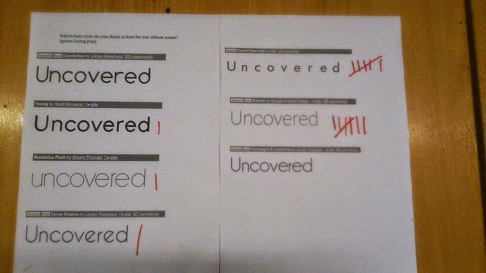
  When researching into the font we wanted to use a suggestion was put forward that we make the 'U' and the 'C' into capitals, when doing this we found that it didn't fit the profile we wanted our digi-pak to look like also may have added some confusion to the audience as to the region of the artist, therefore we have decided not to use this in particular.


No comments:
Post a Comment